
If you are in a situation where you have to create a horizontal scrollable navigation menu for your mobile layout, then you can follow this tutorial to create a horizontal scrollable menu using Elementor.
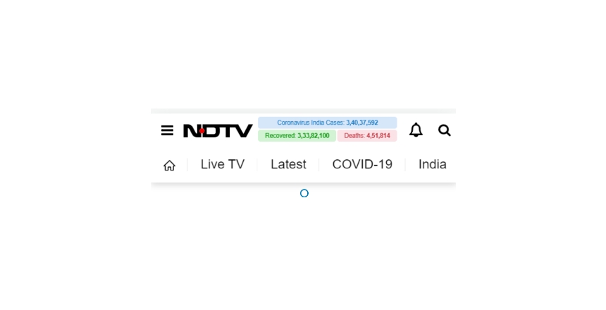
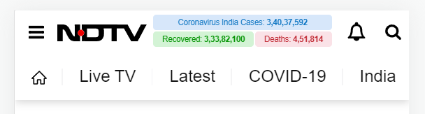
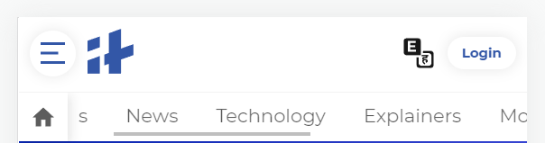
You might have noticed this kind of menu in many popular websites, especially news sites, such as NDTV, India times, there are many more out there but it is enough to understand what I am talking about.
With this kind of menu, users can easily navigate to other categories or trending topics.
Steps to Create Horizontal Scrollable Menu in Elementor for Mobile
Step 1: Edit your Header & Add(Create) A Section for your mobile menu
Step 2: Add a “nav menu” widget inside the section.
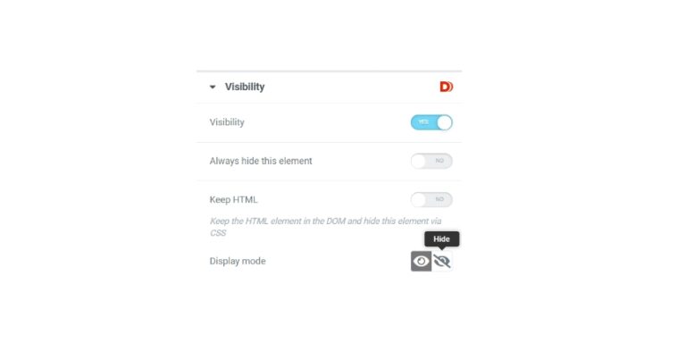
Step 3: From Advanced > Responsive, enable the toggle for the hide on Desktop and Tablet. With this, the complete section will be hidden when opened on Desktop and Tables, as such will display only on mobile devices(which we need for this tutorial).
Step 4: Set a menu for your nav menu widget, you can create a new menu out of the existing post categories.
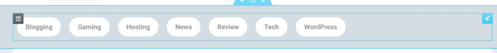
Step 4: Give your Navigation Menu widget a class from the advanced tab, for example, .overflowmenu
Step 5: (Optional) Use the below CSS in the Custom CSS option to give a button layout to your menu items
.overflowmenu .elementor-item {
background: white;
padding: 20px;
margin: 10px;
border-radius: 30px;
}
Step 6: Use the below CSS in Custom CSS to enable the Horizontal Overflow with scrollbar
@media screen and (max-width: 768px) { .overflowmenu .elementor-nav-menu--layout-horizontal .elementor-nav-menu {
display: flex;
flex-wrap: nowrap;
white-space: nowrap;
overflow-x: auto;
-webkit-overflow-scrolling: touch;
-ms-overflow-style: -ms-autohiding-scrollbar;
}
}
Step 7: (Optional) Use the below CSS to hide the scrollbar
.overflowmenu ::-webkit-scrollbar {
width: 0; /* Remove scrollbar space / background: transparent; / Optional: just make scrollbar invisible */
}
Congratulations! You have created the Horizontal Scrollbar menu successfully. Now, you can do some other customizations to give it a look and feel that you desire.

thats cool. Do you know a way to scroll automatically to the selected item?
Thank you so much Alex. Yes, you can automatically scroll to the selected item by using selectors in the links for the menu items.
Kindly let me know if it is something you were looking for.
Thank you so much!
Please provide a detailed explanation.
Hey, please join our community and share what you exactly want to achieve, rest assured you will get the answers. Do you want to set it on a specific element on load?
Thank you so much, I thinked this was more complicated to do than really is
You’re most welcome Alecsander. Thanks for your comment. 🙂
Is there a way to make the submenus here to also work, since it is not functioning on mobile, when flex-wrap is set to nowrap. Submenus then appear as a vertical scroll. Is there a way to make the submenu go over the border of the menu and expand down?