

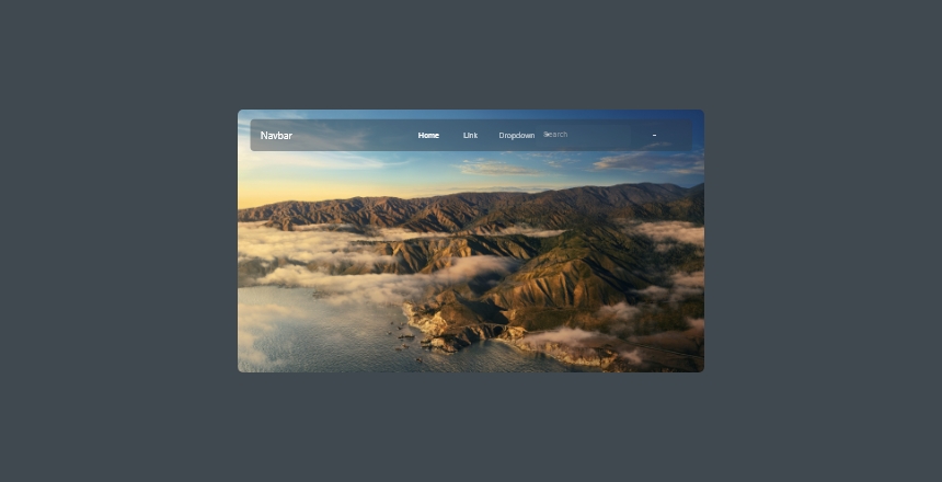
A blurred animated sticky header with Elementor looks like a five-minute job until you paste the CSS everyone shares and absolutely nothing happens. That snippet was written for sections and columns. Container-based headers, which Elementor has built by default since V3, ignore it. Here is the CSS that does work, where backdrop-filter is safe to ship, and what the blur really costs while somebody is scrolling.
Quick verdict
- Best overall:
backdrop-filteron the header container, triggered by theelementor-sticky--effectsclass that Elementor Pro adds on scroll. Every current browser renders it unprefixed. - Best free route: CSS
position: stickyin your theme stylesheet plus a five-line scroll listener that toggles your own class. Same result, no Pro license, no plugin JavaScript. - Skip it if: your header is tall and full-width, your hero is a looping video, or your analytics are dominated by cheap Android handsets. A stuck blur re-rasterizes against moving pixels on every scroll frame.
- Our call: ship it, but at a 12px radius over a background around 55 percent opaque, keep the
-webkit-line for older iOS, and profile it on a real phone before you sign it off.
What backdrop-filter does, and where it works
backdrop-filter blurs whatever sits behind an element rather than the element itself. That is the entire trick. Two rules follow from it and both catch people out.
First, the header has to be at least partly see-through. Google’s own write-up puts it plainly: the overlaying element must be at least partially transparent. A solid background color produces a perfectly functional sticky header with an invisible blur behind it.
Second, the effect stops at the nearest backdrop root. MDN lists what creates one: any ancestor carrying filter, opacity below 1, mask, clip-path, mix-blend-mode, or a will-change naming any of those. Give a wrapper opacity: 0.99 and the blur quietly stops seeing the page.
| Browser | Unprefixed since | Released | Notes |
|---|---|---|---|
| Chrome, Chrome Android | 76 | July 2019 | Oldest unprefixed implementation. |
| Edge | 79 | January 2020 | Chromium Edge. Nothing older matters now. |
| Firefox, Firefox Android | 103 | July 2022 | The old scroll-lag bug is resolved. |
| Safari, Safari iOS | 18 | September 2024 | Safari 9 to 17 need the -webkit- prefix. |
In practice that means no polyfill, no feature detection for the layout, and one prefixed line for the iPhones that have not been updated. Baseline still calls this Newly available rather than Widely available, so a @supports fallback earns its place.
Step 1: Make the header sticky in Elementor
Open your header template in the editor, select the parent container by its handle, then go to Advanced and expand Motion Effects. Elementor documents these fields as follows.
- Sticky: set to Top. Bottom exists but is not useful for a header.
- Sticky On: pick Desktop, Tablet Portrait and Mobile Portrait. Dropping mobile here is a legitimate performance decision, and one worth making deliberately rather than by accident.
- Offset: pushes the stuck element up or down in pixels. Leave at 0 unless you have an admin bar or announcement strip to clear.
- Effects Offset: how many pixels the visitor scrolls before the effect state kicks in. 120 is a sensible starting point.
- Stay in Column: irrelevant for a full header. Leave it off.
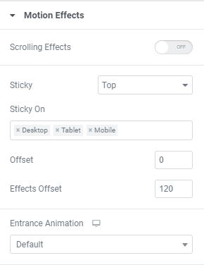
The one thing the panel will not tell you: Effects Offset does nothing on its own. All it does is decide when Elementor adds the elementor-sticky--effects class. If no CSS is keyed to that class, the setting appears broken. Elementor says as much in its transparent header documentation: it works only when you apply Custom CSS.
Step 2: Add the blur CSS
With the header container still selected, expand Custom CSS in the same Advanced tab. This is an Elementor Pro field. Inside it, selector is Elementor’s shorthand for the element you currently have selected, so you never need to hunt down a generated class name.
/* Elementor Pro > Advanced > Custom CSS, on the header container */

/* 1. Resting state. Only the background fades; nothing here forces layout. */
selector {
    transition: background-color .28s ease;
}

/* 2. Stuck state. The frosted glass. */
selector.elementor-sticky--effects {
    background-color: rgba(14, 16, 22, 0.55) !important;
    -webkit-backdrop-filter: saturate(150%) blur(12px);
    backdrop-filter: saturate(150%) blur(12px);
}

/* 3. Optional shrink. Boxed containers only: a full-width
   container has no .e-con-inner, so put the padding on selector instead. */
selector > .e-con-inner {
    transition: padding-block-start .28s ease, padding-block-end .28s ease;
}
selector.elementor-sticky--effects > .e-con-inner {
    padding-block-start: 10px;
    padding-block-end: 10px;
}

/* 4. Readable fallback where backdrop-filter is unavailable. */
@supports not ((backdrop-filter: blur(1px)) or (-webkit-backdrop-filter: blur(1px))) {
    selector.elementor-sticky--effects {
        background-color: rgba(14, 16, 22, 0.94) !important;
    }
}

/* 5. Respect the OS setting. */
@media (prefers-reduced-motion: reduce) {
    selector,
    selector > .e-con-inner { transition: none; }
}
The !important on the background color is not decoration. Elementor writes container backgrounds from the Style tab with enough specificity to win otherwise, and its own sample CSS uses the same flag.
If you are maintaining an older site built on sections and columns, .e-con-inner does not exist. Swap the shrink block for this and leave the rest alone:
/* Legacy sections and columns only */
selector.elementor-sticky--effects > .elementor-container {
    min-height: 70px;
}
selector > .elementor-container {
    transition: min-height .28s ease;
}
Step 3: Float the header over your hero
A blurred header only reads as glass when there is something behind it. Getting the header to overlap the first section takes two settings, not CSS:
- On the header container, set Advanced > Z-Index to something above your hero, for example 99.
- On the page’s hero container, apply a negative top margin equal to the header height, then add matching top padding so the copy is not hidden underneath.
Do this on the hero, not the header. Pulling the header up with a negative bottom margin works until Elementor switches it to fixed positioning on scroll, at which point the margin stops meaning anything and your spacing jumps. If only the homepage needs the transparent treatment, build a second header template and split them with display condition rules rather than trying to make one header do both jobs.
Step 4: Verify it, properly
Publishing and glancing at the page is not verification. Four checks, in order:
- Regenerate CSS. WP Admin > Elementor > Tools > Regenerate CSS & Data, then purge your page cache and any CDN. Elementor writes per-element CSS to files, and a stale file is a very common reason a correct snippet appears to fail.
- Open the page in a private window and scroll past your Effects Offset value. Watch the header, not the console.
- Open DevTools, select the header element, and confirm
elementor-sticky--effectsappears in its class list as you scroll and disappears when you scroll back to the top. If the class never lands, the problem is Motion Effects, not your CSS. - Turn on Paint flashing in the DevTools Rendering panel and scroll. The header repainting green on every frame is expected. How much of the viewport goes green alongside it is the number you care about.
Then load it on an actual iPhone and an actual mid-range Android. Desktop Chrome on a development machine will render this beautifully no matter how badly it is built.
What breaks
- Nothing visibly changes. Your CSS targets
.elementor-containerbut the header is a container. Elementor’s own transparent-header article carries a note saying that code only works with sections and columns. - The background changes, the blur does not. Either the background is fully opaque, or an ancestor created a backdrop root. Check for stray
opacity,filterandclip-pathon wrappers first. - The blur flickers at the edges while scrolling. That is a reported Chromium rendering issue rather than your code. Reducing the radius and keeping transforms off the same element usually settles it.
- Effects Offset is ignored. Beyond the missing-CSS cause above, an Elementor issue report covers the offset value not being honoured against the sticky active class. If your threshold behaves oddly, test with the offset at 0 to isolate it.
- Text becomes unreadable over pale hero images. WCAG 1.4.3 wants 4.5:1 on normal text, and a translucent bar has no fixed contrast ratio. Raise the background opacity until your darkest and lightest heroes both pass.
- It works, then stops after an update. Regenerate CSS and clear caches before assuming anything else. Cached CSS files outlive plugin updates that changed the class names underneath them.
The catch: what this costs on scroll
Here is the mechanism, because it explains everything else. A stuck header sits above content that is moving. Every scroll frame changes the pixels behind it, so the blurred region has to be sampled and recomputed again. Cost scales with the area covered and the blur radius. A 12px blur on a 70px bar is modest. A 40px blur on a 140px full-bleed header on a 4K monitor is a great deal of work, repeated sixty times a second on a 60Hz display.
Google’s guidance is unusually blunt for documentation. The backdrop-filter article linked above carries a plain caution that it may harm performance and to test before deploying, and the animations guide recommends restricting animation to transform and opacity, the two properties that skip layout and paint entirely. backdrop-filter is not on that list.
Two things follow. Animate the background color and, if you must, the padding. Both fire once when the class toggles, so that is a one-off 280ms cost, not a per-frame one. Never animate the blur radius, because that hands the compositor a fresh blur to compute on every single frame of the transition.
And resist reaching for will-change: backdrop-filter. The same Google guide says to use will-change sparingly and only when you have already seen a graphics problem, because layer creation carries its own cost.
If Firefox is your worry, it should not be any more. The Mozilla bug about laggy backdrop blur during scroll is marked resolved and fixed, with the WebRender work landing years ago. The advice to avoid backdrop-filter because of Firefox is out of date.
What most Elementor tutorials still get wrong
The uncomfortable one first: none of this shows up in Core Web Vitals. INP measures clicks, taps and key presses. Google states outright that hovering, zooming and scrolling are not observed for it. Your field data can sit comfortably under the 200ms good threshold while the header stutters on every scroll on a three-year-old phone. No Lighthouse audit will flag it. No monitoring tool will page you. You find it by scrolling on cheap hardware, or you never find it.
That also means no plugin fixes this. WP Rocket and Perfmatters change what loads and when. They have no influence over what the compositor repaints once the page is sitting there. Worth knowing before you go looking through your speed optimization checklist for a setting that does not exist.
The second thing tutorials miss is that Elementor moved. Elementor ships as version 4 now, and Elementor states that from April 2026 all new sites run version 4 by default, with existing sites updating manually. That matters here because the V4 sticky control lives in the Style tab under Position and sets a genuine CSS position: sticky. No JavaScript watches the scroll. No class is toggled. The elementor-sticky--effects hook this entire recipe depends on is not emitted at all.
So if you are on V4 atomic elements, you need a scroll-driven animation or your own listener. If you are on V3 containers, everything above applies. Check which one you are actually in before spending an afternoon debugging CSS that was never going to fire.
Which route should you take?
- You already own Pro and the header is V3 containers. Use Motion Effects plus the Custom CSS above. It is the least work, and the class hook is maintained for you.
- You are on free Elementor. Do not buy Pro for this alone. Give the header
position: sticky; top: 0; z-index: 99in your child theme, then toggle your own class:
const header = document.querySelector('.site-header');

addEventListener('scroll', () => {
  header.classList.toggle('is-stuck', scrollY > 120);
}, { passive: true });
Style .is-stuck with exactly the same background and backdrop-filter rules. The passive: true flag matters here, because it tells the browser your listener will not block the scroll.
- You are on V4 atomic elements. Set Position to sticky in the Style tab and add the class toggle above. The sticky part is handled natively; only the state change needs you.
- You are rebuilding anyway and this pattern matters to you. Bricks and the other visual page builders worth comparing each solve sticky state their own way. Not a reason to migrate on its own, but worth knowing before you commit another five years to a header.
Whichever route you take, build the header once and reuse it. A global widget for the nav, a proper header template, and the same discipline you would apply to a single post layout will save you from maintaining this CSS in four places. If your mobile navigation is doing something more ambitious, a horizontal scrollable menu tends to behave better inside a short blurred bar than a stacked one does, and the wider Elementor addon ecosystem has header widgets that handle the state classes for you.
Frequently Asked Questions
Does a blurred sticky header need Elementor Pro?
For this recipe, yes. Sticky lives under Motion Effects and the Custom CSS field is a Pro feature. On free Elementor you get the same look with CSS position sticky in your theme stylesheet plus a short scroll listener that toggles a class, which is the route in the decision section above.
Why is my backdrop-filter blur not showing at all?
Three usual causes. The header background is fully opaque, so there is nothing to see through. An ancestor has opacity, filter, mask or clip-path, which creates a backdrop root and clips the effect. Or the CSS targets elementor-container on a container-based header, which no longer exists.
Do I still need the -webkit- prefix?
Keep it. Safari only shipped unprefixed backdrop-filter in version 18, released September 2024. Anyone still on iOS 15 through 17 needs -webkit-backdrop-filter to see anything. It costs one extra line, so leave it in until your own analytics say those versions have gone.
Does backdrop-filter hurt Core Web Vitals?
Not in the way most people assume. INP measures clicks, taps and key presses, and Google states scrolling is not observed for it. So scroll stutter from a blurred header never lands in that score. The cost is real, it is simply invisible in field data.
What blur radius should I actually use?
Start around 10px to 14px with a background sitting at 50 to 60 percent opacity. Larger radii across a full-width bar sample far more pixels per frame for very little extra visual effect. Whatever number you settle on, never animate the radius itself.
Why does the Effects Offset setting seem to do nothing?
Effects Offset only controls when the elementor-sticky–effects class gets added. With no Custom CSS keyed to that class there is nothing for it to trigger, so the field looks broken. Elementor documents this directly: the setting works only when you apply Custom CSS.
How does this work in the Elementor V4 Atomic Editor?
It does not, directly. V4 moves the control into the Style tab under Position and sets a real CSS position of sticky, with no class toggled on scroll. To change appearance once the header locks you need a scroll-driven animation or a small script of your own.
Will a translucent header pass an accessibility audit?
Only if you check it against real content. WCAG 1.4.3 asks for a 4.5 to 1 contrast ratio on normal text, and a translucent header changes contrast with whatever scrolls underneath it. Test against your darkest and lightest hero, then raise the background opacity until both pass.
Our call
Build it. The effect is cheap to implement, the browser support argument is settled, and a frosted header genuinely helps a hero image breathe in a way a solid bar does not.
But build it small. 12px of blur, a background near 55 percent opacity, a header no taller than it needs to be, and a @supports fallback so the text stays legible where the effect is unavailable. Transition the background, never the blur radius. Keep the -webkit- line.
Then scroll it on the cheapest phone in your drawer. That thirty seconds is the entire quality gate for this pattern, because nothing in your analytics is ever going to do it for you.



Hi, I also have a dropdown in my menu, how do I get the same blur effect on that?