

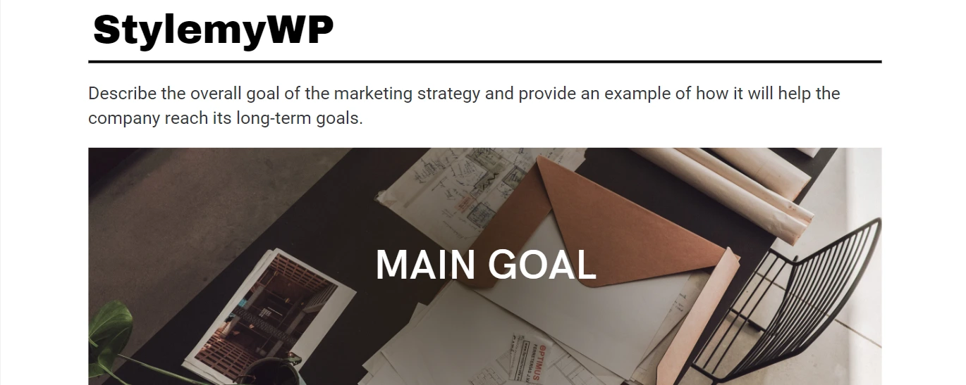
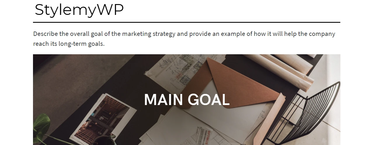
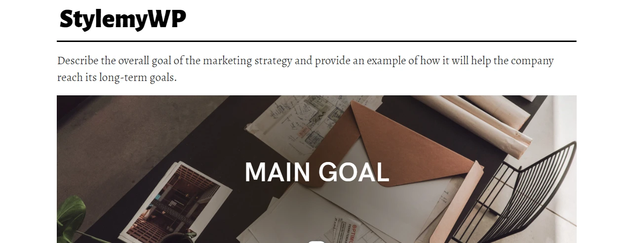
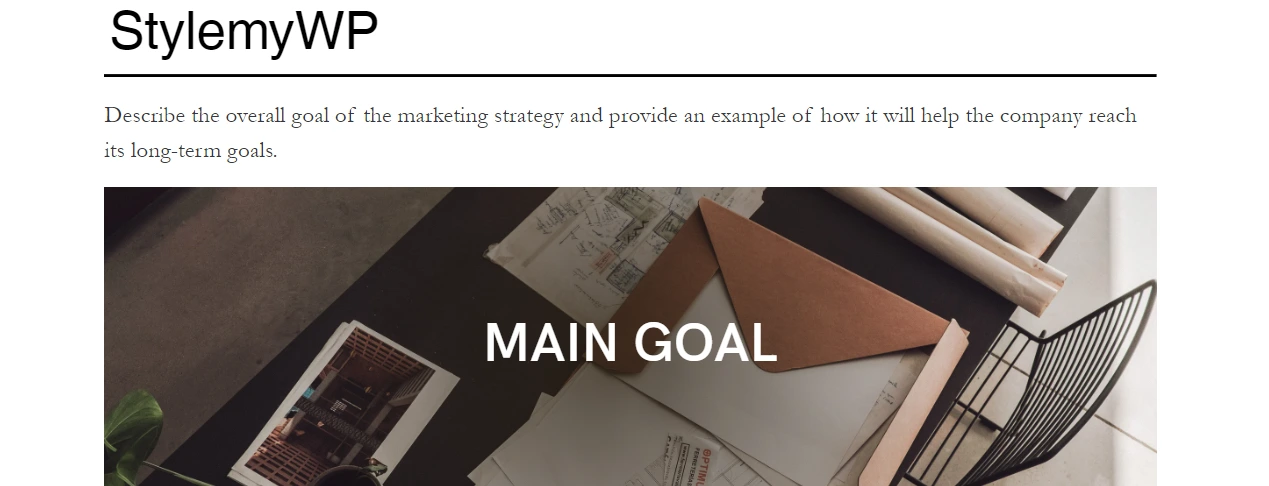
Typography plays a significant role in the web design process. If you’re having difficulty choosing the right font combinations for your web design, rest assured that you’re not alone. The selection of appropriate fonts is a critical decision that affects the overall look and feel of your website. A well-chosen font can elevate the professional and polished appearance of your site, while an inappropriate one can result in an unprofessional and chaotic impression.
When deciding on fonts to use for your website, it’s crucial to consider legibility, readability, and aesthetics. It is essential to select fonts that are effortless to read on any device while also ensuring they complement each other harmoniously in terms of style and mood. As a web designer, it is your duty to make critical choices for each website you create. These decisions encompass picking color schemes, crafting user interface interactions, ascertaining navigation layouts, and opting for the most fitting fonts.
You may be wondering why it’s crucial to consider font combinations. The fact is, selecting the right combination of fonts can greatly enhance the visual appeal and engagement level of your website design for your audience. It imbues the text on your site with a unique personality and style, making it more recognizable and memorable. Additionally, In website design, it is crucial to employ different fonts to establish a distinct hierarchy, sustain visitor engagement, and convey the personality of the brand.
To resolve this problem we wanted to create a great list of font combinations, so we looked for different font pairings and uses. We didn’t just choose the usual sans serif/serif fonts that work well together. We searched in different places like Google Fonts, Adobe Fonts, and Fonts.com. Eventually, this will save you a lot of time and effort in researching.
Let’s take a glance at some of the top font combinations for web design.
List of Best Font Combinations for Web Design in 2026
Archivo Black & Roboto
The combination of Archivo Black and Roboto is perfect for creating a modern, sleek, and professional look on your website. Archivo Black is a bold, sans-serif font that adds a touch of elegance to the design, while Roboto is a clean and easy-to-read font that complements it perfectly.
Additionally, these fonts can be used together to create headers, body text, and other graphic elements.
Montserrat & Source Sans Pro
If you’re looking to create a more minimalistic yet sophisticated look, Montserrat and Source Sans Pro are an excellent combination. Montserrat is a versatile sans-serif font that works well as both headlines and body text. Paired with Source Sans Pro’s clean lines and easy readability, this duo creates a balanced and visually appealing website design.
Lato & Merriweather

To achieve a timeless and classic appearance, a perfect pairing would be Lato and Merriweather. Lato is a contemporary sans-serif font that is adaptable and effortless to comprehend, whereas Merriweather is an exquisite serif font that imparts a hint of refinement to the layout. The two fonts work in sync to produce a well-proportioned blend of modernity and traditionalism.
Abril Fatface & Lato

For a bold and eye-catching look, consider using Abril Fatface and Lato together. Abril Fatface is a high-contrast serif font that adds drama and impact to the design, while Lato’s clean and modern lines balance it out. This combination works well for headlines and featured text on your website, instantly grabbing the viewer’s attention.
Alegreya Sans Black & Alegreya
To achieve a seamless and unified design, it is recommended to use Alegreya Sans Black and Alegreya in combination. Alegreya Sans Black is a strong sans-serif font that works well for headlines or any emphasis required, whereas Alegreya is a graceful serif font that provides easy readability, making it the perfect choice for body text. This coupling generates an exquisite and contemporary look, guaranteeing that your website will exude professionalism and aesthetic appeal.
Brianna Hand & Clarendon
John Maeda designed Brianna Hand, an elegant typeface with a vintage vibe, in 1993. It is suitable for headers, titles, or any text-heavy portion of your web design. Clarendon is a clean sans-serif font that complements Brianna Hand perfectly and offers stability and readability to your site’s content. The combination results in a modern but sophisticated look that distinguishes your website from others. However, it’s crucial to use this pairing judiciously and purposefully to avoid overwhelming your audience. To add a touch of uniqueness to your website, consider using this duo for select headers or titles.
Helvetica & Garamond
For many years, designers have relied on the classic and timeless combination of Helvetica and Garamond. Helvetica is a sans-serif font that is known for its clean and simple design, making it suitable for headers and subheaders. On the other hand, Garamond is an elegant serif font that adds sophistication to the body text.
This pairing creates a balance between modernism and tradition while ensuring easy readability, making it an excellent choice for websites that aim to appear professional yet approachable. By using this combination, you can create a visually appealing website that exudes cleanliness and sophistication.
Libre Baskerville & Source Sans Pro

If you’re looking to combine serif and sans-serif fonts, a great duo to consider is Libre Baskerville and Source Sans Pro. The classic and elegant Libre Baskerville is a top choice for body text, while the modern and clean Source Sans Pro is the perfect complement for headers and subheaders, adding clarity to your website. This pairing strikes a balance between tradition and innovation while ensuring maximum readability, making it an ideal option for websites related to education, arts, or literature. Choosing this combination will result in a harmonious blend of fonts that will enhance your website’s appearance.
Times New Roman & Century Gothic
Combining Times New Roman with Century Gothic is a great way to balance tradition with contemporary style. Times New Roman brings a classic and elegant touch, while Century Gothic offers a clean and sleek look. This combination works well for websites that want to convey sophistication and innovation. Just like any font pairing, ensure that you use them consistently throughout your website to create a cohesive visual identity that resonates with your audience.
Georgia Pro & Futura
One of the best font combinations for web design is Georgia Pro and Futura. Georgia Pro is a serif font that is easy to read, especially in large chunks of text. On the other hand, Futura is a sans-serif font that adds a modern touch to your website. When used together, these fonts create a beautiful contrast that enhances readability and aesthetics. Additionally, they are both widely available on most computers and devices, making them accessible to all users. So if you’re struggling with choosing fonts for your website, consider using Georgia Pro and Futura for an attractive and professional look.
Roboto Condensed & Open Sans
If you are aiming for a website with a contemporary and minimalist design, you may want to consider utilizing Roboto Condensed and Open Sans fonts. Roboto Condensed is a sans-serif font that has been streamlined to fit headings perfectly, while Open Sans is known for its exceptional readability, making it an excellent choice for body text.
This font combination is particularly suitable for technology-related websites like tech blogs or online stores selling electronic devices. By incorporating these fonts into your website, you can achieve a modern and fresh appearance while ensuring ease of reading. Moreover, the sleek lines of these fonts create a feeling of simplicity that facilitates navigation on your site for users.
Exo 2 black & Alegreya Sans
For websites that are focused on art or creativity, Exo 2 Black and Alegreya Sans could be the perfect font pairing. Exo 2 black is a modern and elegant sans-serif font that works well for headings, while Alegreya Sans is a classic serif font with soft curves and a subtle yet refined appearance, perfect for body text.
This combination adds a touch of sophistication to your website while maintaining its artistic flair. You can use it for websites related to graphic design, photography, or any creative field to elevate the look and feel of your website.
Bebas Neue & Old Standard
If your website leans more towards vintage or retro themes, you may want to use Bebas Neue and Old Standard fonts. Bebas Neue is a bold and distinctive sans-serif font that can be used for headings or logos, while Old Standard is a classic serif font that brings out the charm of the past.
By combining these two fonts, you can create a nostalgic yet stylish look that perfectly captures your website’s theme. This font pairing is perfect for vintage fashion websites, antique shops, or any website that wants to evoke a feeling of nostalgia. The contrasting styles of these fonts work well together to create a unique and memorable website design.
Montserrat & Open Sans
For a clean and modern appearance, Montserrat and Open Sans are excellent font pairings. Montserrat is a sans-serif font with sharp edges that give it a contemporary look perfect for headings, while Open Sans is a simple yet elegant font for body text.
This combination is ideal for websites related to technology, software, or any other industry that requires a professional touch. The minimalistic style of these fonts ensures that your website looks sleek and modern, making it easy for users to navigate.
Lato & Roboto
Lato and Roboto are decent font combos for websites with a simple and sophisticated aesthetic. Lato’s understated charm works well for headings, while Roboto’s sleek style is perfect for body text. This combination is ideal for health, wellness, or lifestyle websites as it creates a welcoming atmosphere with easy-to-read fonts. The clean lines also enhance the user experience. Overall, Lato and Roboto offer a flawless pairing for those seeking clarity and subtlety in their design.
Playfair Display & Raleway Thin
If you’re going for a sophisticated and polished look, try pairing Playfair Display with Raleway Thin as your font of choice. Playfair Display’s curved serifs lend an air of refinement, while Raleway Thin’s straight, slender lines give it a more modern feel.
This font combination is particularly fitting for websites related to luxury goods, high-end fashion, or any industry where elegance is paramount. The contrast between the two fonts produces a stunning visual effect that will undoubtedly make a lasting impression on your audience. By incorporating these fonts into your website design, you can create an atmosphere of luxury, style, and grace that is sure to captivate your visitors.
Source Sans Pro & Times New Roman

For a more traditional and classic feel, consider pairing Source Sans Pro with Times New Roman. While both fonts are widely used, they still retain a timeless elegance that is perfect for websites related to education, law, or politics. Source Sans Pro’s clean lines complement the sophisticated curves of Times New Roman, resulting in a design that exudes professionalism and authority.
Additionally, the legibility of these fonts ensures that your content will be easy to read and understand. If you want to convey a sense of trustworthiness and reliability to your audience, this font combination is an excellent choice.
FAQs
Which font size is best for visual comfort?
When it comes to visual comfort, there is no one-size-fits-all answer as different people may find different fonts more comfortable. However, in general, sans-serif fonts like Arial or Helvetica are often considered more comfortable for on-screen reading as they have simpler and cleaner letterforms that are easier on the eyes. It’s also essential to consider factors like font size and spacing, line length, and contrast to ensure maximum legibility and comfort for your website visitors
What font style would be most suitable for a website?
The choice of font style for a website should be based on its purpose and branding. Sans-serif fonts, in general, are perceived as more contemporary and minimalistic, while serif fonts can provide a sense of refinement and classiness. It is crucial to select a font that is easy to read, aligns with your brand’s character, and harmonizes with the overall look of your website.
Additionally, keep in mind elements such as font size, spacing, and contrast to ensure that your site looks visually attractive and offers a user-friendly experience for your audience.
Which font Combination is best for a website?
When it comes to font combinations for a website, it’s crucial to strike a balance between readability and aesthetics. One popular combination is pairing a serif font with a sans-serif font. For example, using Archivo Black & Roboto, Times New Roman as the heading font, and Arial as the body copy font can create a classic and professional look.
Ultimately, the best font combination for your website would depend on your branding and messaging goals, so take your time to choose the right fonts that convey your message effectively while offering an excellent user experience.
What font do you consider the most professional?
When it comes to professional fonts, there are several options to choose from. Serif fonts such as Times New Roman and Georgia have long been associated with professionalism and academic writing. However, sans-serif fonts like Helvetica are also popular choices for their clean and modern look.
the most professional font depends on the context and message you want to convey. Choose a font that is legible, easy on the eyes, and fits your brand’s personality and tone.
Which is the most similar Google Font to Chalet Oblique?
If you like the look of Chalet Oblique and are looking for a similar Google Font, consider trying out Lato or Open Sans. Both fonts share similar qualities in terms of their geometric shapes and clean lines. However, it’s important to note that while these fonts may be similar, they still have their own unique characteristics that set them apart.
Are all of the mentioned fonts free to use?
The appropriateness of fonts largely depends on the purpose for which they are intended. Many free font libraries and websites offer access to fonts such as Raleway Thin, Source Sans Pro, and Times New Roman. However, it is important to note that some restrictions may apply to their commercial use or require giving credit to the original designer. Therefore, it is essential to thoroughly review the terms of use before incorporating any font into a design project or website.
Over to You
In the end, we can say that the overall design of your website can be significantly impacted by the selection of the appropriate font combination. Regardless of the type of website you’re designing, there is a suitable font pairing that can help you create an impressive design. The key is to carefully consider the attributes of your chosen fonts and identify a matching pair that will enhance their characteristics.
For example, if you opt for a bold and modern font for your headers, you can pair it with a classic serif font for the body text to achieve a well-balanced and cohesive layout. Similarly, if you choose an ornate or cursive font for your logo, you can combine it with a simple sans-serif font to ensure readability and clarity throughout your website’s content. By making an informed decision about font combinations, you can create an exceptional design that resonates with your target audience while also enhancing your brand image.
We hope this article has helped you understand the importance of font selection and pairing for website design. Always take the time to research and review the terms of use before incorporating any fonts into your projects, and experiment with different pairings to find a combination that best represents your brand’s style and message.